What makes a documentary?
A documentary is a long video which usually has a topic of choice. An example could be a wildlife documentary, which could involve information about wildlife with videos of animals which would link to the topic. A documentary usually shares a large amount of information with the viewer which usually goes in depth.
In a documentary, firstly I'd expect an introduction which would give a quick overview about the information which will be shared with the viewer. and what the topic choice may be. Depending on which type of documentary it is, it may or may not have stages which could reveal the truth or the final stage. A good example of this would be a murder documentary. A wildlife documentary would probably have a less advanced structure due to the lack of stages which would be linked to the subject of choice.
Documentary sub-genres
There are many sub-genres documentaries. DocuDrama/Historical dramatise historical events which have been acted out. DocuDrama documentaries focus more on the facts and exaggerate them or dramatise them, in order to entertain and educate the target audience.
Biographic/Autobiographic are films that are non-fictional and primarily focus on an important part of someones life, to which they dramatise it. The filmmaker makes a record of historical events within their life.
Nature/Science documentaries are films about plants, animals, or any other living creatures which are non-human. These films are usually filmed within different habitats of living animals or plants. Nature documentaries can also focus on our link towards these animals or plants, and can also be of different ecosystems. Science documentaries provide a sense of mystery and wonder of how our lives have differentiated due to science, and how it could affect us during the future.
Travel documentaries describes popular tourists attractions and travel in a way which is non commercial. A popular sub-genre are Comedic Travel documentaries.
Ethnographic documentaries revolve around the evolution of humanity and is often orientated around non-Western people.
Crime documentaries entertain viewers with a portrayal of the grim side of humanity (horrific murders), the corruption of particular groups and the flaws which lie within the criminal justice system.
Rockumentary usually revolve around musicians and rock music. Most often, a Rockumentary is a life performance/concert.
Documentary Modes
A documentary mode is a project which was created by an American documentary theorist names Bill Nichols. A documentary mode seeks to distinguish particular traits and conventions of many documentary types.
The Poetic Mode:
- Artistic expression and subjective.
- The poetic mode of documentary shifts away from the true reality of a certain situation or people to find an inner truth that can only be reached by poetical manipulation.
- In the poetic mode emphasises on tonal, rhythmic qualities, descriptive passages, formal organisation, and visual associations rather than prioritising mood, tone. and texture.
- Images and songs are used to create a feeling or meaning relating to a subject.
- Poetic mode usually has a lack of voice over, narration, key participants, or a direct dialogue with the audience.
Performative mode:
- Focuses on the expressive and subjective aspect of the filmmaker's own input with the subject and an aud
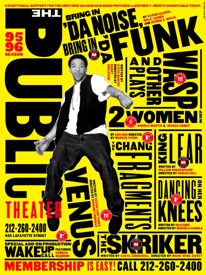
HAPPY - A Mental Health Documentary
1. What is the documentary genre?
It seems to be a Biographic documentary as it seems like it was made by someone who has experienced mental health issues and is now talking about it.
2. What conventions of a documentary does it use and why?
Talking heads, as many people were interviewed during the length of the documentary, and voiceover narrations as there were parts during the documentary where the person is not present but a voice is present, which is a voiceover.
3. What documentary modes are used and why? Give evidence that includes screenshots to confirm your answer
Observational mode as it gives the impression of 'lived' or in 'real time'. Participatory mode is also used as many people were interviewed. We also had a representation of multiple view points.
(Someone being interviewed)
4. Give one specific area that this student documentary could be improved. It could be narrative structure, camera/sound recording or editing.
Video quality, video stabilisation, microphone quality, lighting on some clips (Many of these issues can be improved on software such as Premiere Pro. Could have trimmed down some audio clips to make it more professional. Colour grading, reducing brightness in some clips would give the documentary a cleaner look and make it look more professional as a whole.
Identity
- The elements of an identity are to identify a logo or something similar by the colours, typeface, symbols or other elements added to a logo. These elements should symbolise their logo.
- The purpose of an identity is for a logo to be identified by certain aspects used within the logo design. These are mainly colours, typeface and more. It is important for companies to have their own identity so they can be easily identified upon a glance. For example the NHS logo is easily identified by the colour, typeface, and the 3 capital letters.
- The 38 degrees identity is well known for its bold and capital typeface, the bright orange background, and the 38 degrees angle the logo is placed on, which matches the same 38 degrees. Some designs of the logo include people within the picture, which would symbolise people, power, and change which is also written in the logo.
- The use of identities in campaigning is make the organisation instantly recognizable to who the company are by the colour, typeface, and other details within a logo. Their visual identity should instantly represent about what they are about or what they offer.
Propp Character Theory/Todorov Narrative Theory
Batman Begins (trailer) identify characters
Hero - Batman
Villain - The Scarecrow
Princess - Rachel Dawes
False hero - Henri Ducard
Helper - Alfred Pennyworth
Donor - Lucious fox
John Wick
Hero - John Wick
Villain - Viggo Tarasov, Iosef Tarasov
Princess - Revenge
False Hero - Viggo Tarasov
Helper - Winston
Donor -
Equilibrium - Living a normal life
Disruption - His dog gets kills and car gets stolen
Recognition - He must get revenge on those who killed his dog and stole his car
Repair - He kills the ones who killed his dog and stole his car, and kills others who are close to them for revenge
New equilibrium - The villains are now dead, however his close friend had died whilst helping him and he himself is badly injured, he got his car back and bought a new dog
Typeface Examples
Photography - Manual mode
All of these photos are high quality and in focus, however in blogger the quality doesn't look as good.
This photo was taken so that the wall was in focus to show the pattern within the wall. A high aperture was used here.
This photo was taken as a low exposure style shot which also used high angle. I thought this picture was a good idea because the light to the left has a nice contrast to the overall low exposure of the photo
This photo was taken to show a pattern in the picture with the side posts but also used a style of portrait at the same time
This photo is nature photography, the aperture used in the photo is high which gives a nice blur effect and keeps the plant in focus whilst being sharp.
Same as the photo above, however here a lower aperture was used to give the photo sharpness and to make sure the photo was not overexposed.
This is an example of high angle photography, the subject is meant to look small in this photo.
This photo was taken to be an example of line and shapes within photography. Again a high aperture was used here to keep the rail in focus and keep the background blurred.
This is an example of a low angle portrait shot, however lines was also used in this photos as the curb and the wall were used in the photo.
This photo is another low angle shot, where the camera has been slightly tilted to give this off balance effect.
In this photo the style used here was low exposure. For example these shots can be used as an example of horror. The lights at the top look very dim giving the expression that this photo was used in a horror shot or something similar. I had also used shape and lines within this photo to make everything look even and symmetrical.
Same as the photo above.
This is a portrait photo where the light was used as a nice backlight to light up the hair of the subject.
Constructivists
Shepard Fairey - He is an American contemporary artist. He is the founder and an activist of OBEY Clothing who appeared from the skateboarding scene. During the year 1989, he had designed a sticker campaign named "Andre the Giant Has a Posse" whilst attending the Rhode Island School Design. His designs contains many colours, with the majority of his work having a red or light blue tone. His work contained lines, shapes, people, and objects.
Paula Scher - She is an American graphic designer, painter, and an art educator in design. She had also served as the first ever female principal at Pentagram, which she joined in 1991. Her work contained mainly words and the colour scheme consisted of mainly yellow.
David King - David King was a British writer, designer, and historian of graphic design. The majority of his work seems to use a variety of colours, mainly yellow and red. Shapes, objects, and lines are all present in his art.
Who designed it?
Contructivist graphic design was founded in 1915 by Vladimir Tatlin and Alexander Rodchenko. Abstract and austere art which was aimed to reflect modern industrial society and urban space. They were usually associated with Soviet socialism and propaganda.
When was it designed?
Constructivist graphic design was founded and created back in 1915.
What was it for?
Constructivist graphic design was created to reflect modern industrial society and urban space. They were associated with Soviet socialism and propaganda.
Find examples for each of these designers that shows inspiration from the Constructivists: Shepard Fairey, Paula Scher, David King
Shepard Fairey - This poster uses blue and red which contrast nicely when compared to the background. Hope is written at the bottom of the poster to symbolise that there is hope for America. Patterns, designs, and more are used in the background in order to add depth and prevent emptiness from the poster.
Paula Scher - This poster by Paula Scher contains mainly text and typography. Yellow is the primary colour used, and the secondary colours include red and black text. Typography is placed on lines, and the text seems to be orientated to match theme of the poster.
David King - David King was a British designer, writer, and a historian of graphic design. He had a large collection of Soviet graphics and photographs. He has left a great legacy for graphic designing. His style was unique for his time, he had mixed bold sans serif headlines which later became a defining feature of many posters and publications. This poster uses lines to give the text direction and different colours has a nice contrast against each other.
B-roll task
They use mid angle, and the b-roll in the documentary could be the slideshows that appear with questions. Their use of interviews are well done due to the angle, and the placement of the subject. Good use of transitions between the interviews. Good use of different backgrounds between the interviews. Another B-roll at the end when the student was sitting on the bench with his head down. (Use of still images).
They framed the documentary quite well. The slideshow with the questions could be better. The gradient looks a bit cheap and the type could be better (and the placement of the text). The quality of the lighting is really good, however at the end for the B-roll the iso could have been lower, or the shutter speed could have been quicker in order to reduce the exposure of the shot. The camera let in too much light.
The B-roll adds to the A-roll by using slideshows and still pictures through the documentary. It does change the flow of the documentary in a good way. The slideshows with questions help to break up the documentary and the pictures at the end and the start give a professional look to the documentary.
What is Surrealism? Surrealism is when something is different to normal reality. It can be very strange or unconventional.
Why is Surrealism used in campaigns? Surrealism is used in campaigns as it highlights certain attributes or special features of a product. Surrealism can also be an escape from our reality and can be very good at attracting customers to a certain product due to the odd imagery.
Select one image from Lex Drewinski, Michal Batory, Jan Švankmajer or Roman Cieślewicz
(Jan Svankmajer)
Explain what it was created for and your response to it. It was created from his imagination, I think it looks cool due to the numerous amount of shells. I don't think it was created for a specific reason, however I feel like this design came from his own imagination.
Describe how it would appeal to an audience. It would appeal to an audience due to the design choice and the patterns used with the shells. Surrealism is a big factor here due to the unusualness of the design.
Select an example of surrealism in advertising and analyse its appeal. An example of surrealism could be the image below due to the water bottle in the advertisement. The mountain underneath the bottle has a contrast to the surroundings. The advertisement used the mountain to make the water look fresh and cold.
Describe the surreal elements, what is surreal about it? Surreal elements within this photo would be a random snow mountain in the middle of a hot climate. A water bottle connected to a mountain is also surreal.
Link it to the target audience. The water in this advertisement looks fresh, crisp and cold which everyone wants when they buy water.
Explain the positive reasons for using surrealism. Positive reasons for using surrealism. Some positives of surrealism: Completely different to the reality we know, and can be used to attract customers for advertising or other purposes.
Are there any drawbacks? Drawbacks could include: Some surrealism advertisements may not be what they seem to be, can be hard to create.
Constructivists Poster
Above is my Constructivist poster, the topic is Global Warming. I had made this by blurring and changing the contrast, brightness and more of the background picture. I had made the earth layer transparent and had shaped text around the earth. I stayed with the red, blue, black and white colour theme. The magic wand tool, object selection tool, and the lasso tool were the main tools used to create this Global Warming poster. Overall I am satisfied with this poster. I feel as if I had used colour theme well to match the topic of choice. I had kept the poster simplistic to stay with the clean look. Sans serif typeface was used for all of the text within this photo.
Surrealism Poster

This is my Surrealism poster. I had used 3 different background images and had blended them together with the smudge tool to create a messy, blurry division between the two images. I also wanted them to look like one picture. The top left image was a normal sunny sky, however I had changed all the colour profiles and had added layers and effects in order to create that surreal look. I had also added lightning to the sunny sky, and had blended the end in as that would be very surreal. The top right image was a normal night time shot of the sky with the moon. I had again altered all the colours and had added effects and layers to totally change the look of the image. In order to make it look even more surreal, I had added a rainbow and had altered the ends of the rainbow making it look as if it was part of the imager. This wouldn't usually be in a night sky, making it look very surreal. The bottom photo was a normal looking beach photo. I changed the look by totally changing the colours, contrast and more. I have added a city to the sea and had blended it in to link the poster to both Global Warming, and Surrealism as a City would never be in the sea. The colour theme was meant to be orange, which links to Global Warming. Black and white text was also used to keep it simple. I think that this poster was successful as it had ended up how I originally envisioned it to be. I had made the text legible by outlining the text with another colour. For example I had outlined the white text with a black outline. With the black text I have used a white outline to make the text as legible as possible. I had also used a Slab Serif typeface called Rockwell.
Designers and Social issues
Tibor Kalman - He was an American Graphic Designer with a Hungarian Origin. He was renowned for his great work as editor in chief of colours magazines. During the early 90s, Tibor had helped to produce a series of controversial advertisements which usually focus on racism, aids, and multiple other issues. This had made Tibor editor in chief.
This poster focuses on the surrealism aspect of posters. Two heads are coming from the body. Colours are also important within this photo, the shade of the animal is green, which is surreal.
Adbusters - Adbusters is an organisation which create Adbuster posters. They are a media foundation and are based in Canada, their work is non profit and they are a pro enviroment company of whom were founded in 1989 by Bill Schmalz and Kalle Lasn in Vancouver, British Columbia. This is where their headquarters are now based. They used text, images, and a variety of colours depending on the topic choice of their posters. As their names suggest, they focus on busting ads. Surrealism is also commonly used within their designs.
This vodka is surreal as glass bottles do not fall like the image shows. The surrealist poster can symbolise the side effects of vodka if drank in excess.
Brandalism - Brandalism are an organisation and type of posters where the main focus are on an anti advertising movement. Brandalism design is a common way of forming creative activism that use design and advertising to replace ads in public areas all around the world. Some examples of Brandalism could be wildfire posters, global warming posters, and more.
This poster has used the climate crisis and someone had created this poster to as a form of creative activism. The type is in bold to emphasise on their movement.
Led by Donkeys - Led by Donkeys are a group who are an anti Brexit group, they were established in December 2018, by a British political campaign group.
Surrealist Photography
Ronen Goldman is an Artist and a Conceptual Photographer from Tel Aviv, Isreal. His segment of professionalism was creating photo dreams in which he had created photographs illustrating his own dreams. His photography is unique due to his editing style. Surrealist photography is when a shot doesn't seem like it would appear in our normal life or reality due to the strange imagery portrayed within the photo. These photos are usually edited after in order to create a photo which looks surreal. These surreal images often tend to tap into peoples unconscious or are usually dreamlike. Many surreal images are usually elements combined together in unexpected and odd ways. These elements are usually from real life, such as clocks, fruits, figures, toys, and more which can be arranged in unusual and strange ways. To summarise, Surrealism aims to revolutionise human experience. Below is a piece of work created by Ronen Goldman.
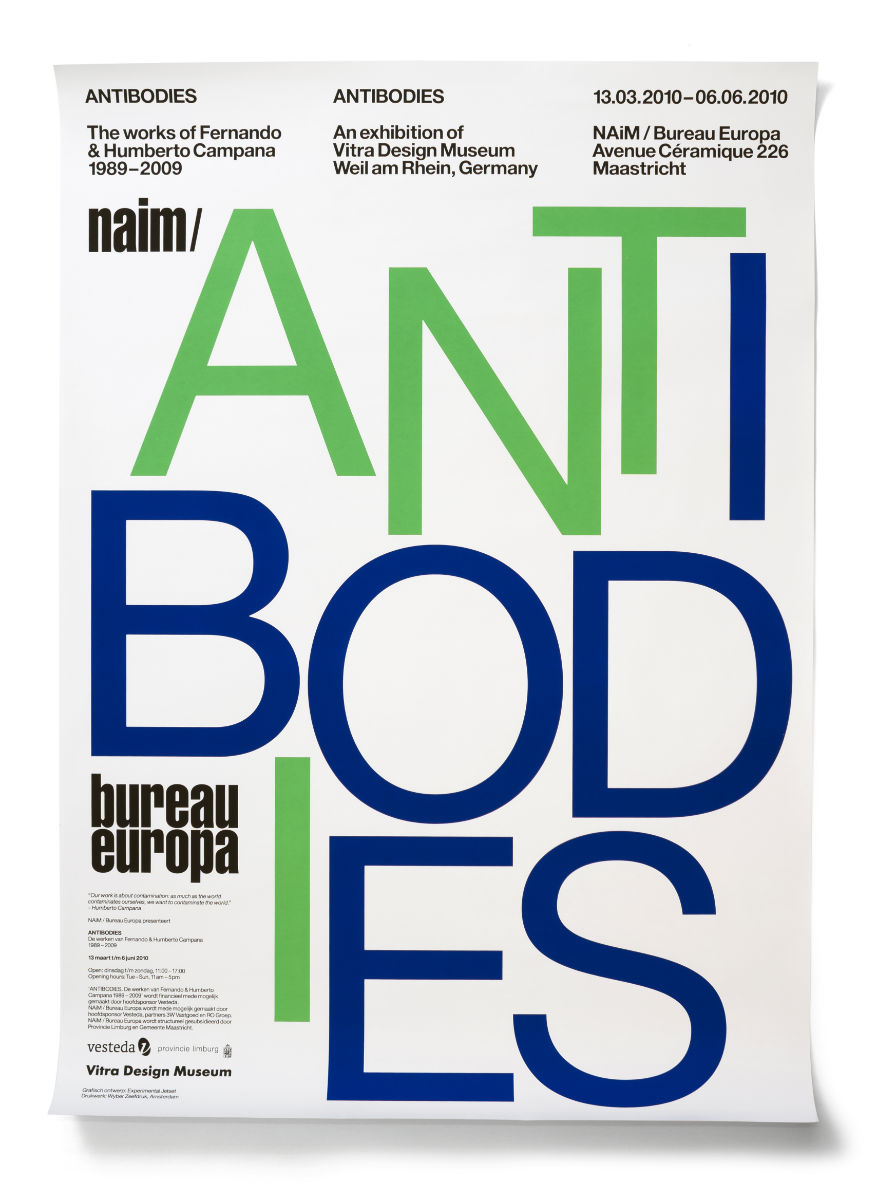
Experimental Jetset
Adobe Illustrator is a software which is mainly used for magazine purposes and using type. Illustrator offers way more type options compared to other Adobe platforms, making it perfect for magazine designing, text to place on posters, typeface designs, and more. Illustrator offers many custom features for professionals.
The photo below is an Experimental Jetset poster and uses type and a minimalist design in order to keep the poster looking clean. The red, black, and white design is used to create contrast between the text, background and small designs. Shapes and direction are used to create the design and layout of the poster.
Below is another Experimental Jetset poster on Antibodies. A green, navy, black, and white colour theme were used here to keep the poster simple. White backgrounds seemed to be most common with these Experimental Jetset posters. Type is the main design aspect of this poster and creates the layout and shape of the poster as a whole.
Above are examples of Experimental Jetset. Experimental Jetset is a small graphic design group, an independent graphic design studio. This group was only made up of three people, those being Marieke Stolk, Danny van den Dungen and Erwin Brinkers. They all graduated in Amsterdam, the Gerrit Rietveld Academy. After their graduations, all three of them collaborated and combined their ideas to create Experimental Jetset. They have focused on their methods of "turning language into objects" working mainly on site specific installations and printed matter. Experimental Jetset have worked on projects for multiple institutes around the world.
My Experimental Jetset poster
Above is my Experimental Jetset Poster - Global Warming. I had attempted to create a poster using type only rather than using imagery like my other two posters. Experimental Jetset posters are focused on type only. I had used a sans serif typeface to create a simplistic look rather than having sharp edges and slabs on the edge of my letters. I feel as if my poster went well, as I feel like I had used type successfully to create a poster that looks full and professional without using any images. Lines were used to divide space without the use of imagery. I had used type on these lines to create shapes and to give my poster a seamlessness effect and look.
Surrealism Photography
This photo was my own imagery. I had added multiple effects, an eye, and zombie arms to give the surrealist look. I had changed the colour scheme to make the picture look unusual. The original picture that was taken was a cone as shown below. I had used Photoshop to edit this photo.
This photo was a picture of the floor outside in Stanmore College (my own imagery). Skulls were added to make the image look surreal. I had used a variety of effects such as radial blur, and adding grain to my image. I turned down the opacity of the skulls to make it look as if it was engraved to the floor. The original image that was used for this photo is below. I had used Photoshop to edit this image.
Iso and aperture
Shooting Modes - On a modern camera there are multiple modes to choose from. The most popular modes are auto, 'Av, Tv, P, M'. Auto mode automatically chooses your settings for you depending in the environment and situation. The camera will determine the shutter speed, iso, and aperture when the shutter is pressed. Other modes either give some control or all control.
Av - Aperture Priority and Aperture - Aperture priority allows the photographer to change the aperture, whilst the camera automatically chooses the shutter speed and iso. Semi automatic is another term for this. Aperture is the size of the opening in the lens which allows more or less light through the lens. Higher aperture lets in less light, however a lower aperture lets in more light. A higher aperture also allows for more subjects within your shot to be in focus and to be sharp, this is usually good for landscape photos. A lower aperture (f stop) is perfect for portraits as it blurs the background, making the person the subject. A higher f stop has a large depth of field, and a lower f stop has a small depth of field.
Tv - Shutter Priority and Shutter Speed - Shutter priority is another semi automatic mode, where the aperture and the iso is decided by the camera, but the shutter speed is determined by the user. Shutter speed is measured in seconds for longer exposure shots, and fractions of seconds for quick shots. A higher and longer shutter speed lets in more light to get into the shot. This is perfect for long exposure pictures where the camera is still. A lower and short shutter speed doesn't let in much light, however the picture is sharp whilst taking handheld shots. A short shutter speed is perfect if you wanted to freeze an object, such as shooting wildlife or sports. A longer shutter speed is great if you wanted to blur an a moving object, such as motorway shots, car shots moving fast, and water rushing over a waterfall. With a longer shutter speed a tripod is needed for stability or else the picture will be blurred.
P - Program - Program mode is halfway between semi automatic and full manual. In this mode, you are able to set either the shutter speed or aperture, the camera will find the correct iso accordingly as you adjust the aperture and the shutter speed.
M - Manual - Manual mode gives the person full control and flexibility to determine all the different settings before a photo is taken, The iso, aperture, and the shutter speed must be set by the user depending on the lighting and conditions of the environment where the shot is being took. On the viewfinder an indicator may appear which will alert the user if the camera is over exposed or underexposed, however it will not change automatically and will be left for the photographer to adjust manually.
Iso - Iso is how sensitive the sensor of your camera is to light. Iso measures from 100 - 6400, low to high sensitivity. The higher the iso, the brighter and more grainy the image will be, high iso is used in low lighting conditions. A low iso will give low exposure which is usually used in bright conditions. You want to keep the iso as low as possible as it should be the last resort to increase if changing the aperture and shutter speed doesn't give a bright enough image. Increasing iso too much loses image quality and increases grain. Auto iso is present on most modern SLR cameras, making it easier for beginners. Usually pictures will be grainy if the iso exceeds ISO1600 or 3200, however it depends on the camera. Better cameras will retain image quality and will not produce a grainy image at a higher ISO.
Main goal – My main goal is to alert more people on the current situation with Global warming
Key message – To outline the main problems of Global warming and to show send a message that we must make a change now before it's too late. I’ll do this by discussing future problems if we continue at this current rate. Even small changes to our lifestyles can make a huge difference.
Background – The current situation with Global warming is progressively getting worse and worse. Our bad habits are taking a heavy impact on the earth and wildlife.
Target audience – My target audience is 14-25 year olds, as I feel the younger generation should be educated more in order to make a positive impact.
Concept – To create something that will educate my target audience through mainly imagery, such as through posters
Plan - My plan is to create multiple posters to about global warming. I will be using Adobe Photoshop to create these posters. Different posters will inform my target audience something different for each poster. I will also be creating a documentary on this topic with interviews.
Other institutions that are similar – The UN (United Nations) encourages change on climate change and sustainability. Their aim is to make citizens to participate and help them in their journey by making choices which will be less harmful.
Proposed primary research - I will gather data from surveys and interviews.
Proposed secondary research – I will gather facts and figures that may shock my target audience. This way it may have a positive impact on how they think and future actions.
Short summary of why it would be successful – Usually global warming campaigns focus on older age groups, however I feel as if younger people should be educated on the current situation with global warming, this way they may develop habits that have less harmful effects on the environment. My target audience age group may even teach and correct family habits that could leave a significant impact on our environment over time.
Photography Composition
Rule of thirds - Divide your viewfinder into 9 equal parts (3x3). The intersections should contain the most important subject in the image. If you do this, it prevents your photograph from being boring, keeping the image away from the center making it more visually interesting.
Leading lines - Leading lubes use lines and patterns to lead a viewers eye to the subject of the image. For example train tracks, buildings, roads and more.
Patterning/Symmetry - To find similar looking objects that work together to create an interesting photograph
Framing - Framing is when you use something within the photo frame to enclose or capture a subject within it. For example a picture of a window with a nice view outside (with the nice view in focus).
Depth of Field - To give the photograph some depth by heavily focusing in on the subject close up and giving the background a blur.
Viewpoint - Viewpoint is when you change the angle and view of the Photo being taken. This can dramatically change the result of the image giving you a way better image.
Bird's Eye View - An angle from a birds eye where the viewer is looking down onto the subject. This angle can give a wide view of the subject and the image.
Worm's Eye View - When the Camera is looking upwards at the subject to create the lowest angle shot.
Filming Techniques
Camera Shots - A camera shot is the amount of space that is captured within a frame or a shot. Camera shots are used to demonstrate different aspects of a films setting, themes, and characters.
This makes camera shots extremely important in shaping meaning within film as they strengthen the narrative.
Extreme Long Shots (XLS) - Extreme long shots contain a wide landscape image within the photo to capture more in one frame or shot. It is often used at the beginning of a scene or a film to establish a setting. Establishing shot is what it's also called. Establishing shots don't always have to be XLS's, they can also be wide/long/full shots.
Long/Full/Wide Shots (LS) - A long shot contains a landscape but can give the viewer a more specific idea of setting. A long shot can show the viewers the building where the action will take place.
A full shot contains a full view of the characters. Viewers can take in the costumes of characters and can often help to establish the connection between the characters. In a wide shot the subject will take the whole frame. Usually these terms can be interchangeable.
3/4s or American Shot - This shot refers to a medium long knee shot. It is a translation from a French film criticism, "plan american". The frequent use it had in westerns had gave it its name. A shot that had started at knee level reveals the weapon of a cowboy, which is holstered at his waist.
Mid-shot/Two-shot/Shot Reverse Shot (SRS) - A mid shot contains a shot from a characters waist up. Viewers can see the faces of characters clearer as well as their conversations and interaction with other characters with this shot, the mid shot. This can also be called a social shot as it commonly takes place between a conversation and used in Two-shots and Shot Reverse Shot.
180 degree rule - the 180 degree rule is a simple guideline between the relationship of a character or object with another character or object. An imaginary line called the axis connects the characters by keeping the camera on a side of the axis for every shot in the scene. The first character is always frame right of the second character, who is usually framed left of the first.
Documentary:
The aim of my documentary was to outline the main problems with Global warming through interviews and both imagery. I wanted to convey different views on Global warming through my documentary. I managed to do this by filming interviews with people who share different views by interviewing different ages and groups of people. I still managed to keep an audience by interviewing 16–25-year-olds.
My final item is an Expository documentary due to my documentary constructed to inform and persuade on the current situation of Global Warming. I used interviews to educate others and share a variety of different views and opinions on Global Warming.
My influence in creating a documentary on this topic was the dramatic increase in temperature over the summer, where temperatures hit an all-time high in several countries. I felt like this was a good time to create a documentary on this topic as I'd collect a great amount of opinions through my interviews based off recent events. Flooding and wildfires were also an inspiration, with many taking place throughout 2021 and 2022.
I had made a plan for my documentary and had followed it throughout my production. I decided to fully plan out the layout of my documentary and all the components of my interviews before starting production.
I used a variety of equipment to create my documentary. My interviews took place in the studio, with a black backdrop, lighting equipment, a DSLR camera, a recorder, and a studio microphone. During the postproduction and editing, I used both Adobe Premiere Pro and Adobe Audition. Premiere Pro was used for cutting and trimming out unnecessary parts within my interviews to keep the documentary smooth without stutters. I had used a variety of effects such as gaussian blur to create a cinematic intro. The original video clips from my interviews looked a little too overexposed and grainy, so I used tools and effects within Premiere Pro to remove the grain and help control the exposure levels. I had also colour graded the clips to make them look more professional and studio level.
My form of research for my documentary included both primary and secondary research. Secondary research was used to find out more about the current situation with Global warming. I wanted to do quite a lot of secondary research so I could best link my research to the questions for my interviews. Primary research was also key for my documentary. I had gathered different opinions and information from the various interviews I had done. This gave my documentary structure and is the main source of information which is what I wanted to achieve.
I did run into a couple of problems. For example, once I had filmed all my interviews, I realized one clip was not fully in focus. I had to sharpen the clip within premiere pro without making my video look too harsh. One of my clips also seemed too overexposed by the lighting. In Premiere Pro I adjusted the exposure, brightness and more to turn down the bright lighting, however I also had to make fine adjustments to make sure the clip did not get too dark.
My documentary has a great level of professionalism due to the amount of time and effort I had put into the postproduction/editing side of the project. I made sure the colour grading and the audio editing gave the documentary a positive look and sound. The standard of this documentary is very high, especially considering my interviews, how the clips looked and how the sound was like before editing. My documentary communicates my ideas extremely well. My target was to convey opinions and information through interviews to give my documentary a solid foundation, I feel like I achieved this at a great standard.
My initial thoughts before producing my documentary was to create a 30-minute video with many interviews, however that was cut short by 10 minutes resulting in a 20 minute documentary. I still feel like 20 minutes is more than sufficient due to the time restrictions.
If I were to repeat this process again, I would want to adjust and make some changes to my documentary. For example, I would have liked to film with two cameras, with one being the main camera and the other to break up the clips to give a more creative approach. Now that I have had extensive use with the lighting equipment, next time I'd create a darker look to reduce the noise and would focus the lights towards the center of the frame.
Global Warming Campaign
This is my Global Warming campaign logo:
Global Warming poster for my campaign - for this one I wanted to keep a minimalistic and clean design.
This is a surrealist Global Warming/Climate Change poster. I wanted a poster that would convey the unconventional whilst keeping the topic of Global Warming valid.
Evaluation Of Campaign Project
My campaign was created to promote awareness of the rising global temperatures and climate change as a whole. My campaign compares to other examples I have studied, for example United Nation posters. Some of their posters focus on a clean and simple design. ClimateChangedMe are another climate change campaign group. They are well known for creating surrealist posters and simple but professional looking posters.
The main source of research for my work has been has been both primary research and secondary research. Primary researched was used to research and learn more about the topic, and also to gather famous quotes for one of my posters. Secondary research was used to gather any extra information needed for my campaign. I had gathered loads of opinions and thoughts through my interviews in which I asked multiple questions about the general situation of global warming. Due to my research and opinions gathered for my campaign, I managed to create unique posters which conveys all of my thoughts in a simplistic yet informative matter.
I felt like posters was the right decision as a way to inform others on the situation with Climate Change. Posters are a way of sending a message through an imaginative design which catches the attention of many. I consider all of my posters and my logo a great method of communication for this project due to the vast amount of information sent through my design and text in my work. My project as a whole works great together and has a nice contrast of design, whilst keeping the idea intact.
My work has a purpose, and that specific purpose is to inform and educate my audience on the devastating impacts of global warming and climate change. I want my audience to not only educate themselves through my campaign, but to also take action and make changes within their lifestyle. My posters have commanding lines of text, where I ask my audience to help, famous quotes are also featured on my campaign work to motivate my audience to make a change. My main audience is younger adults and teenagers, this way they'll be educated growing up and hopefully they can educate their family. I want to target a broad audience, this way we can make a positive change as a community. For teenagers and young adults, I feel as if posters are the best way of attracting views. Posters can be seen on advertisement boards, magazines, digital means and more. Posters can target a great number of people whilst being informative and fun for those who prefer colour and images rather than paragraphs.
If I was to improve or modify my campaign project, I would like to create more logo designs and find one that would look a little more complicated than the one I currently have, unfortunately this wasn't a choice due to time constraints. I would say my form of research was the most successful aspect to my work. I had managed to collect both primary and secondary research through a variety of forms, my favourite being interviews. I feel like my poster designs were perfect, they had a nice blend of being informative, being attractive to the eye whilst looking professional.


Comments
Post a Comment